Mastodon moved its new post box after users pushed back
The planned redesign balances a simpler welcome with habits that longtime users already know.
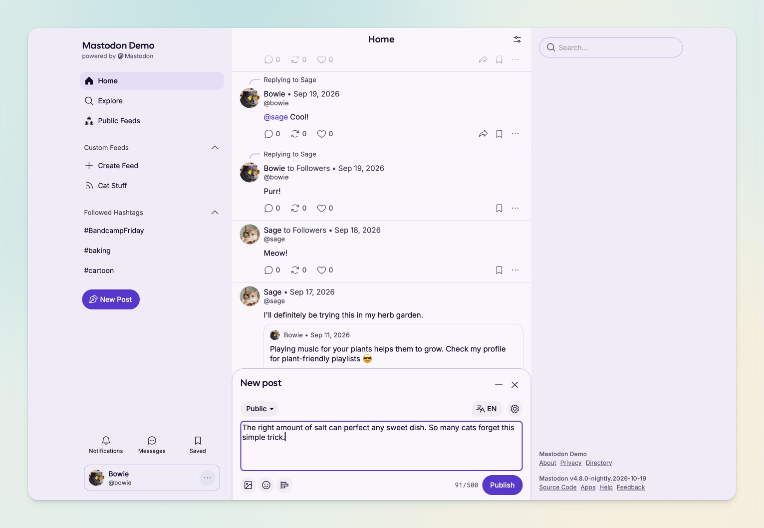
Mastodon wants newcomers to find their way around without making longtime users feel lost. Its October 19 account of the planned 5.0 redesign shows that tension in one very practical decision: where to put the box for writing a post.
After complaints that the proposed bottom-right position was too far from navigation, the team moved the pop-out composer to the bottom centre. It can also be minimised while preserving a draft. Sensitive-media blur and content warnings become separate controls, making an existing capability more explicit.
Design lead Imani Joy described surveys, volunteer workshops and prototype feedback behind the revisions. The post discussed early access on servers using nightly updates and plans for a beta, rather than announcing a finished rollout everywhere. For regular users, the visible result of that feedback is a familiar task in a revised location.